Applying Colour: Communicating Design through Colour Association
We see through rose tinted glasses, things happen out of the blue, we often tell a white lie and there’s definitely a black sheep in every family.
We don’t simply see colour in the world around us, but we also see the world through colour.
Yet a sizeable percentage of the population around the globe is colour blind. Funnily enough, while a large population cannot identify colour, the remaining perpetually debates about the right shade of the same. Moreover, colour doesn’t even help us determine or display shapes.
So it leads us to ask – why is colour all that essential then?
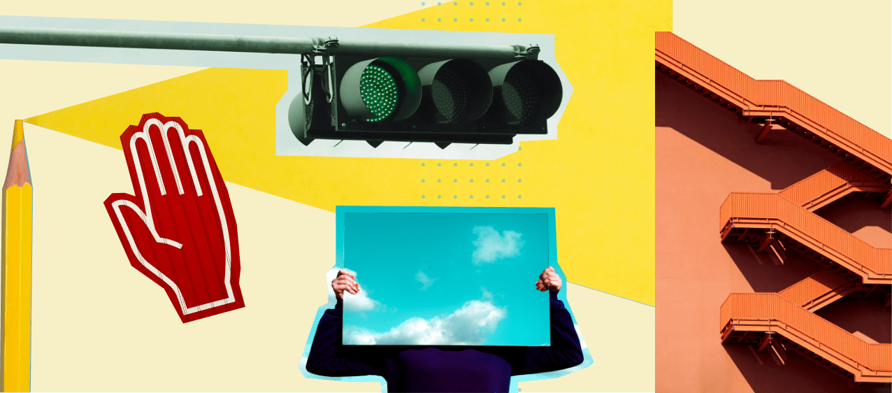
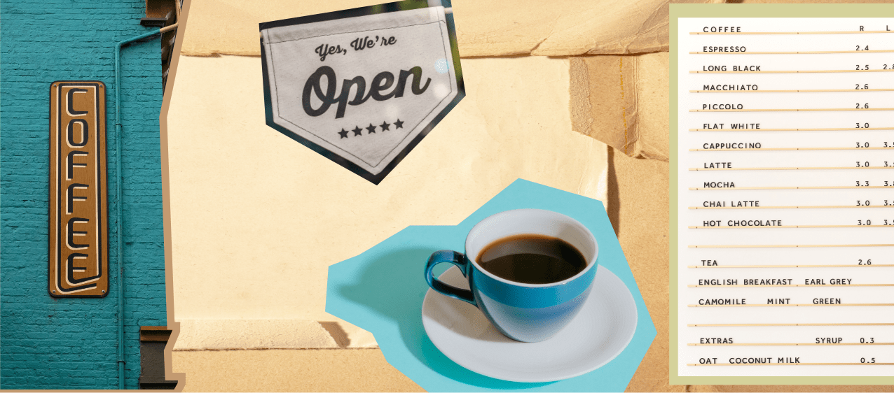
The answer to that is: traffic lights, cooked vegetables, and camouflage.
All of the above work on the organisational principle of colour. Precisely – coding, categorising and labelling, all of which form important functional aspects of visualising data in our everyday lives.
Apart from the obvious civic, domestic and military investment in using colour, the commencement of colour photography in 1935 generated a mass interest in the study of colour. This study of colour reproduction also led to training in reading lighter and darker tones.
As we venture back in time, we come across volumes written about journeys of coloured gems and unique pigments: passionate men and women traded these gems and pigments for jewellery, painting and textiles.
Perhaps it is not surprising that people share a rich emotional resonance with colour. Colour contexts and relationships are not just rooted in location and culture but also shift over time. Where one resides, as well as our personal interaction with certain colours generate specific associations with colour. These are factors that one must account for when analysing colours.
Try a simple word association game with a particular colour in different parts of the world and you’ll learn a thing or two about how colours can elicit ‘positive’ and ‘negative’ associations, depending on the geographic and socio-cultural context.
Try White :
White -angelic-pure-bridal. In Christian contexts white gets associated with chastity and the bride. An auspicious colour that every Christian bride wears. Associated with nuptials, joy and celebration. In many Asian cultures white is associated with mourning. A lot of widows can be recognised due to their ‘colourless’ attire. In one context white signifies abundance and the other a lack.
Colour forms associations not merely in macro-level cultural contexts but also in personal associations. Perhaps, Joseph Albers is correct when he says ‘ colour is the most relative medium’ and that it ‘deceives’. We don’t simply compete with cultural contexts but also colour relevance. Pantone declares ‘a different colour of the year’, every year. So now we also factor in the changing trends and messages colours convey.
Communicating a common message to a large audience across contexts through colour is a unique issue. Yet products distributed across the globe are able to communicate that ‘red’ is for danger. Food packaging features a red dot next to the name of the food item to suggest its non-vegetarian characteristic. It is not just the innate quality of red but the association formed with the colour over time and participation in cultural contexts and markets that leads to such usage. Interestingly, in the consumer space the colour ‘red’ may immediately make us think of the brand Coca Cola. Therefore, newer associations can and have been built with colour by effective and consistent use of it.
That colour does something, is clear to us. How we may use it to communicate attributes of a product or a brand can be done by applying the method of ‘observation and relatedness’. We can take a look at how a majority of the people felt about a particular colour. We can observe and relate the attributes which have been commonly associated with a particular colour to match the attributes of a brand/product/experience.
Let’s sample a few shades :
YELLOW
Sun | Light | Cheerful
One will always notice that the food packaging along the aisles at a grocery store or signs with ‘Sales’ splashed across shop windows are always in yellow hues. The colour yellow is known to pull you in .
Often called a ‘sunshiney’ and positive colour this colour can be seen as used by brands like Nikon, National Geographic, Subway, McDonalds , IMDB , DHL.
They are all brands that target masses and wish to provide a positive experience and/ or provide clarity and pull you in.
*Works best when used sparingly as it reflects too much light and can be a deterrent
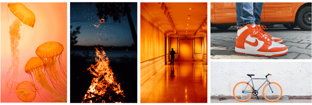
ORANGE
Youthful | Energetic | Exciting
Orange is considered a friendly and inviting colour as well. As a colour it balances out Red’s aggressiveness and yellow’s hospitality by offering an energetic vibe.
Brands like Nike, Harley Davidson, Amazon, Nickelodeon, Fanta and Firefox use orange.
These brands appeal to a target audience that is younger in age and offer experiences and products that are spontaneous, fun and exciting.
*Works well when used as a more dynamic form with movement like a splash or a swoosh
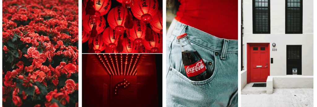
RED
Bold | Dynamic | Passionate
Red is an extremely passionate and bold colour. While on the one hand it is associated with love, on the other hand it is associated with signs of danger and revolution. Thus, Red’s aggression and passion both need to be channeled in design. Red definitely sticks out.
Brands like TED Talks, CNN, Coca Cola, Netflix, Canon and Lays use red.
These are big and dynamic brands that run operations at big stakes.They also promote passion for their product experience.
*Works well as an accent colour or a design element with crisp and sharp lines
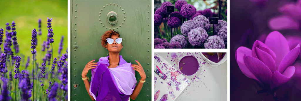
PURPLE
Creative | Artistic | Royalty
Purple is associated with creativity and royalty. Richer hues promote mystery, creativity and imagination.
Some brands which use purple are Yahoo, Cadbury, Barbie and Hallmark.
Purple works for an artistic audience or speaks to a product that encourages creativity.
*lighter hues are used to promote calmness and romance
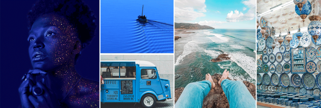
BLUE
Business | Trust | Security
Blues are used mostly by corporations, big brands and banks. It is a colour that says trust and security.
Facebook, Twitter, Dell and HP are some of the big brands that use blue.
These brands endorse permanence, longevity and security.
*be careful about using too much blue as it may create a cold, disengaged feeling
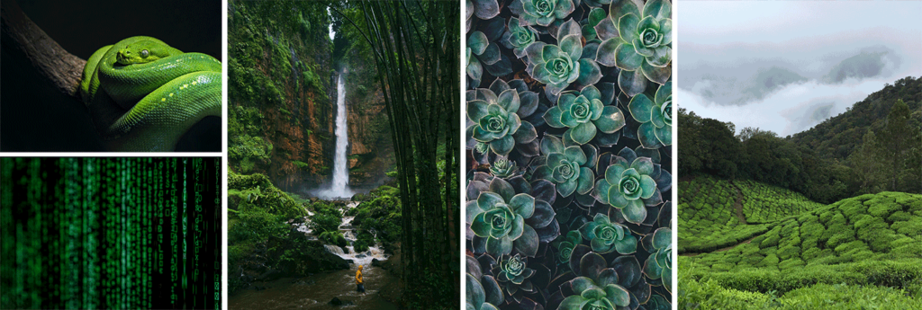
GREEN
Nature | Peace | Health
Think Green and immediately one thinks of nature, it is associated with feeling refreshed and also carries connotations of wealth. A lot of whole foods brands use green for packaging to denote affiliations with nature.
Animal Planet, Tropicana, and Spotify use green.
Using green speaks to a brand that wishes to communicate that the brand is ‘considering nature’.It also communicates peace, prosperity and growth .
*A mix of Yellow and blue, Green creates balance in design
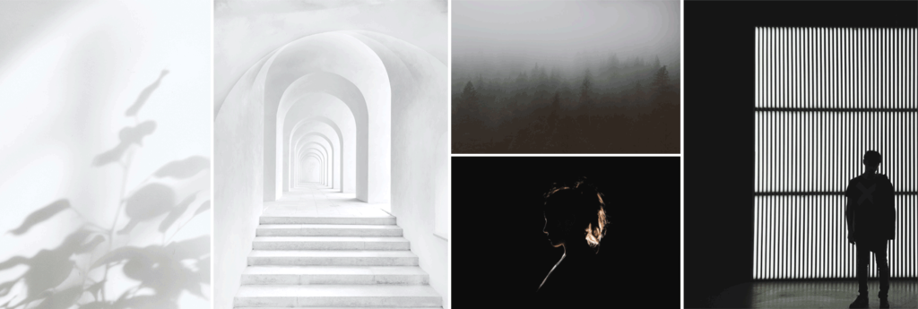
GREY / BLACK and WHITES
Calm | Neutral | Longevity | Minimal
Greys have been there for long and will stay there for long and are used by firms and long standing companies.
Brands like Apple, Wikipedia, Nike and Cartoon Network are very successful companies and have stood the test of time and offer products which have longevity. Black and whites and Greys work for such brands.
*White specifically indicates minimalism, cleanliness and freshness. Black says authority, boldness and firmness
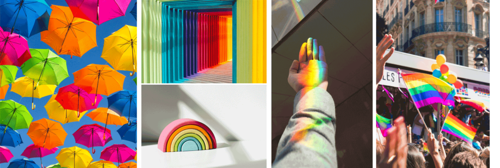
RAINBOW
Playful | Fun | Dynamic
Using multiple colours speaks to a brand that wants to promote a fun working environment and a more playful vibe.
Very big brands like Google, Microsoft and Ebay use multiple colours.
*Using more than two colours at a time is generally a recipe for disaster so should be avoided in design. Although like every other rule, this has its exceptions too.
Warmer tones are usually associated with ‘warmth’, ‘happiness’ and ‘optimism’ while cool colours generally are associated with ‘security’, ‘health’ and professionalism.
It is important to think consciously about what it is that one wants to convey foremost to their customers through colour itself. Even before one engages with a brand or experiences the product, colour is the primary visual a customer may engage with. It shall remain as one of the key attributes of design and branding, therefore we must analyse our application of colour to generate consistent and desired brand outcomes.