Nolen Gur Campaign: Designing a Visual Identity with Cultural Resonance
Client: MistiraBox
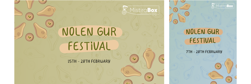
In January, we were faced with the task of creating a campaign around MistiraBox’s Nolen Gur Festival. MistiraBox is a modern gourmet Bengali sweetshop in Ahmedabad, the first of its kind in a city that has a significant Bengali migrant population. While we had developed a visual identity and design language for MistiraBox during the time of its launch, we wanted to create something fresh, youthful, and fun for the Nolen Gur festival. Of course, this would still align with MistiraBox’s broader visual language, but this would also be specific to the campaign.
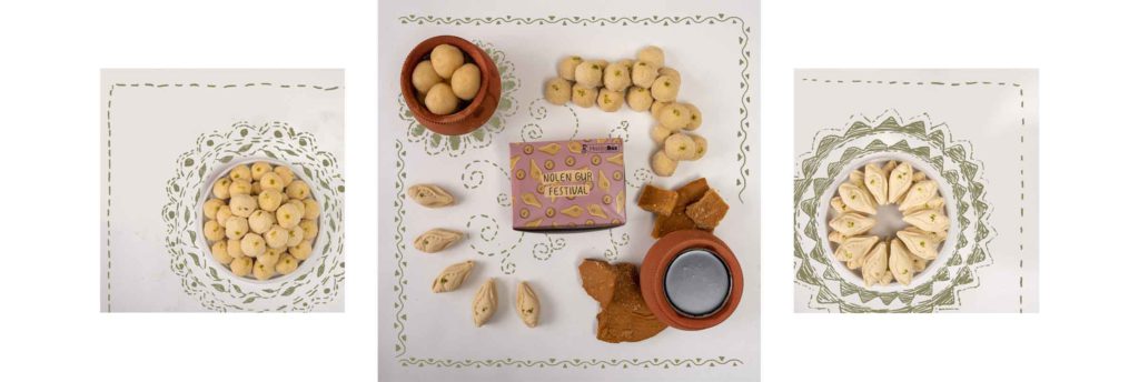
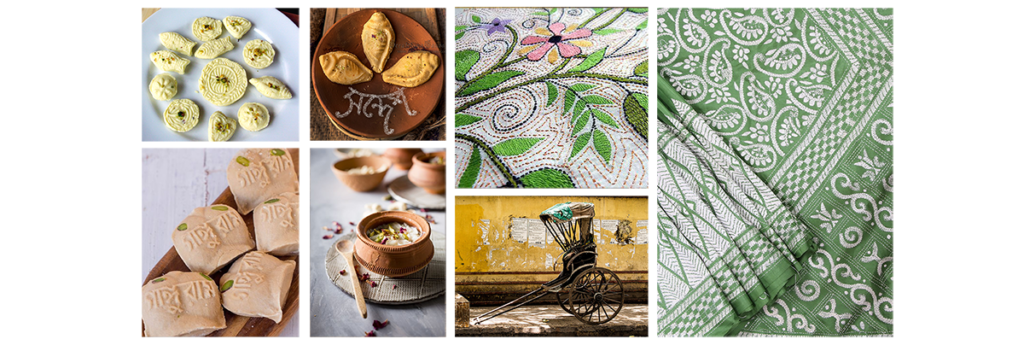
Nolen Gur, or date palm jaggery, floods the innumerable sweet shops of Bengal, during the winter months of December to early March. It is used as an ingredient in a plethora of sweets, including the more traditional options such as the rasgulla, and the conch shaped sandesh, to the more eclectic and experimental options such as the nolen gur souffle, and the nolen gur ice-cream.
Our task while designing MistiraBox’s Nolen Gur campaign was to not only introduce Ahmedabad to nolen gur: the ingredient, but also to the air of excitement and joy that surrounds its profuse availability in Bengal.
The Design Process
After playing around with a few motif designs, we finally settled on the conch shaped sandesh, which is arguably the one of the most distinct and commonly available varieties in the pantheon of Bengali nolen gur sweets. It fit the goal of having a motif that people instantly associated with Bengali sweets, as well as with the campaign, and MistiraBox– the only shop dedicated entirely to Bengali sweets in the city.
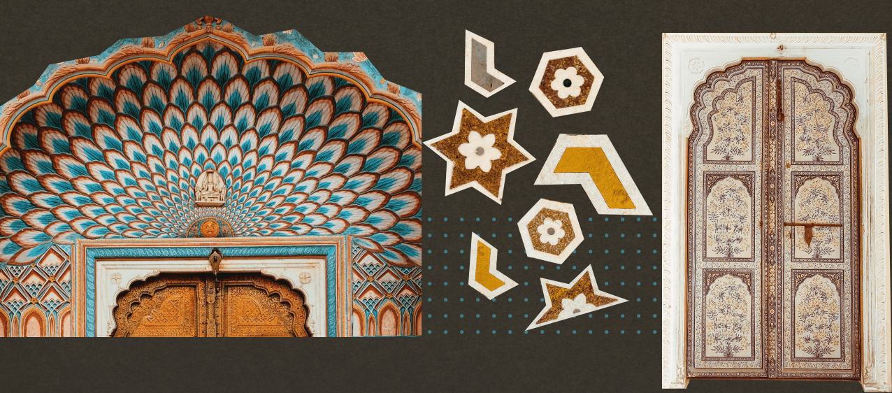
We did not have to search far and wide when picking the primary colours for the campaign; the first colours that come to mind when thinking of nolen gur sweets are the earthy ochres of both, the nolen gur sweets, as well as the clay cups and plates they are served in, and the subtler but ever present pistachio-green that flecks the tops of these sweets.
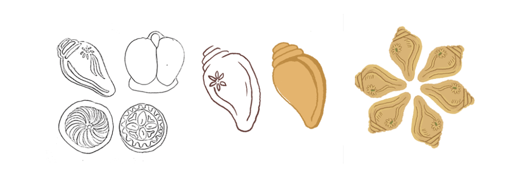
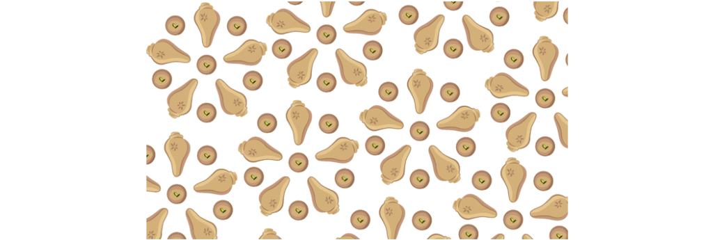
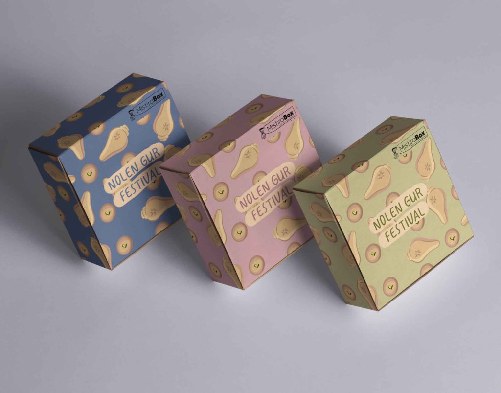
Pattern design is one of the most effective ways of creating a youthful design language for a brand or a campaign. A strong pattern reflects the versatility of the design language, as it lends itself to several applications. In the case of our sandesh motif, we noticed that its shape resembled the petals of the flower that is often moulded on top of the sandesh itself. And hence, this flower pattern emerged (with the assistance of the kancha-golla inspired circular sandesh). We built on this pattern while designing the collaterals for the campaign.
Social Media Campaign
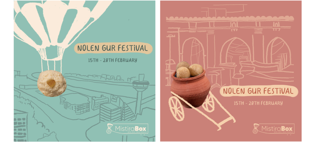
Once the campaign had been launched, we needed to devise a new strategy for some of the social media posts, to keep the visuals fresh and engaging. While the goal was to highlight the nolen gur products through their photographs, we believed that they could be made more interesting with the use of some simple illustrations. So, while the first three posts presented below draw inspiration from the kantha embroidery style of Bengal, the last two posts play with the concept of nolen gur arriving in Ahmedabad. They feature recognisable landscapes of Ahmedabad in the background, with the nolen gur sweet propped onto a whimsical mode of travel.
These posts are an ode to the role of visuals in our cultural imagination;
While the hand-pulled rickshaw has an immediate and obvious association with Bengal, the Kantha inspired designs draw on a more embedded visual memory of the state. For the latter, while the viewer might not immediately be able to locate the source of the source of association– if asked, they might not be able to point out exactly why the visual reminds them of a specific place, but it will tingle the part of their brain that remembers having seen it in a Bengali film, or at a Bengali wedding.
Thus, through the use of subtler elements, we sought to build on MistiraBox’s association with the place and the culture where their food comes from, playing with the sense of nostalgia that exists in the Bengali migrant community. The more obvious visual markers, such as the hand-pulled rickshaw and shell shaped sandesh, were accessible to the larger public of Ahmedabad, contributing to the campaign’s success in announcing the arrival of and generating an interest in the beloved Bengali delicacy: the nolen gur!
